Welcome to the Power Users community on Codidact!
Power Users is a Q&A site for questions about the usage of computer software and hardware. We are still a small site and would like to grow, so please consider joining our community. We are looking forward to your questions and answers; they are the building blocks of a repository of knowledge we are building together.
Comments on Do we want an update for our logo?
Post
Do we want an update for our logo?
"Why an update?" you might ask. The current logo looks nice, but there are a couple of problems which could be solved with an updated logo:
- Is the site name "Power User" or "Power Users"?
- Is the mouse cursor in the Power User logo an accessibility problem?
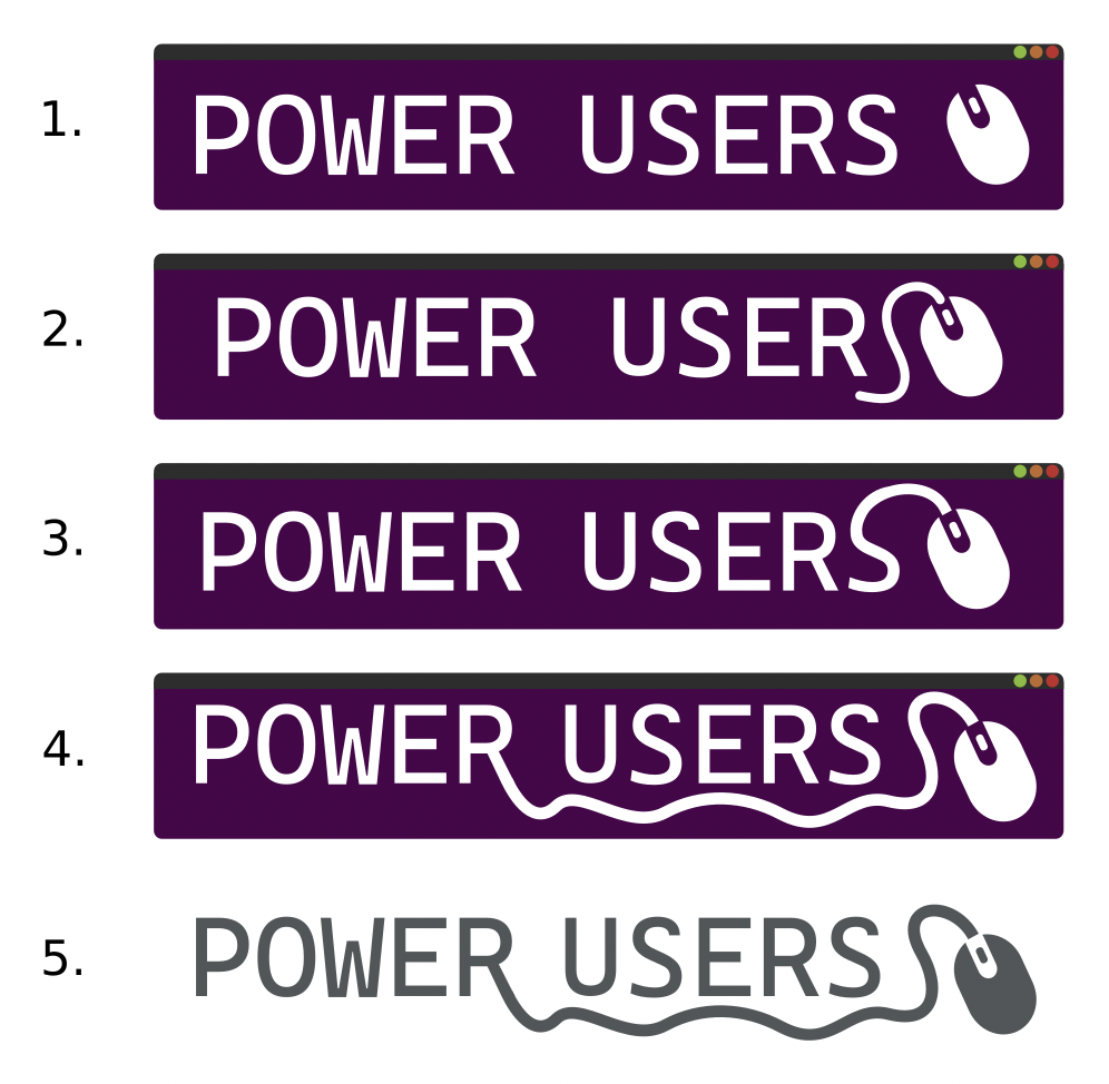
I doodeled around a bit and came up with some suggestions for logos we could use instead:
-
they all add an "S" at the end so that the new logo will match the site name as it is written in the url etc
-
they all use a stylised mouse icon instead of the cursor/mouse pointer to avoid confusion with the actual mouse pointer of the user
-
versions 1. to 4. are a variation of the existing logo. They retain the window decorations at the top and I only made the background a tiny bit lighter so that the dark top bar is easier to see
-
version 5. deviates from the existing design and removes the dark background.
What do you think? Should we update the logo or do you prefer to keep the current one? And if yes, which logo to choose? Do you have any suggestions of your own?

1 comment thread