Welcome to the Power Users community on Codidact!
Power Users is a Q&A site for questions about the usage of computer software and hardware. We are still a small site and would like to grow, so please consider joining our community. We are looking forward to your questions and answers; they are the building blocks of a repository of knowledge we are building together.
Post History
This is what the current logo looks like on a phone screen in portrait mode: Instead of a single line of text, would it be worth considering a logo over two lines, similar to the Meta logo? A...
#2: Post edited
by
 trichoplax
·
2023-02-11T00:00:29Z (over 2 years ago)
trichoplax
·
2023-02-11T00:00:29Z (over 2 years ago)
Rearrange sentence to remove ambiguity
- This is what the current logo looks like on a phone screen in portrait mode:
- 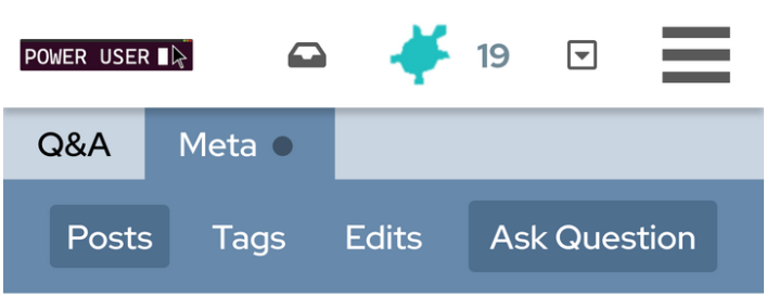
Would it be worth considering a logo over two lines instead of a single line of text, similar to the Meta logo?- 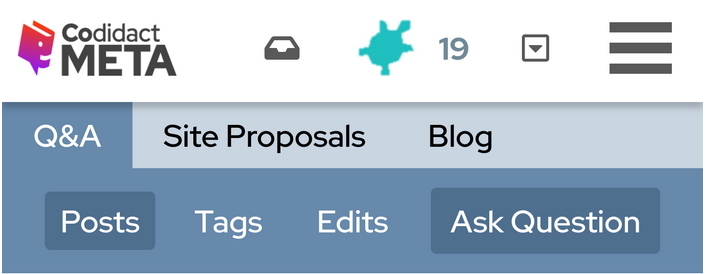
- Alternatively there could be a wide logo for desktop and a narrower, two line logo for mobile. It might be easier to just maintain one narrower one though.
- This is what the current logo looks like on a phone screen in portrait mode:
- 
- Instead of a single line of text, would it be worth considering a logo over two lines, similar to the Meta logo?
- 
- Alternatively there could be a wide logo for desktop and a narrower, two line logo for mobile. It might be easier to just maintain one narrower one though.
#1: Initial revision
by
trichoplax
·
2023-02-10T23:59:14Z (over 2 years ago)
This is what the current logo looks like on a phone screen in portrait mode:  Would it be worth considering a logo over two lines instead of a single line of text, similar to the Meta logo?  Alternatively there could be a wide logo for desktop and a narrower, two line logo for mobile. It might be easier to just maintain one narrower one though.