Welcome to the Power Users community on Codidact!
Power Users is a Q&A site for questions about the usage of computer software and hardware. We are still a small site and would like to grow, so please consider joining our community. We are looking forward to your questions and answers; they are the building blocks of a repository of knowledge we are building together.
Userscript or -style to disable responsiveness of website
I like to arrange my browser on one site of my screen and have room for another application on the other half of the screen. This results in a width of my browser window of about 775 px.
Many sites, Codidact included, will seriously squash their layout at such narrow widths, see e.g. the following screenshot of the Power Users front page:
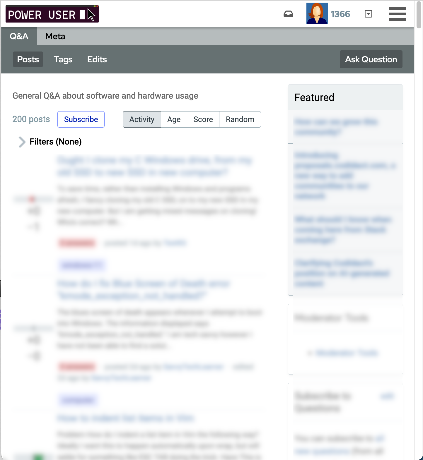
The main column gets very narrow and most of the headline is hidden and requires extra clicks.
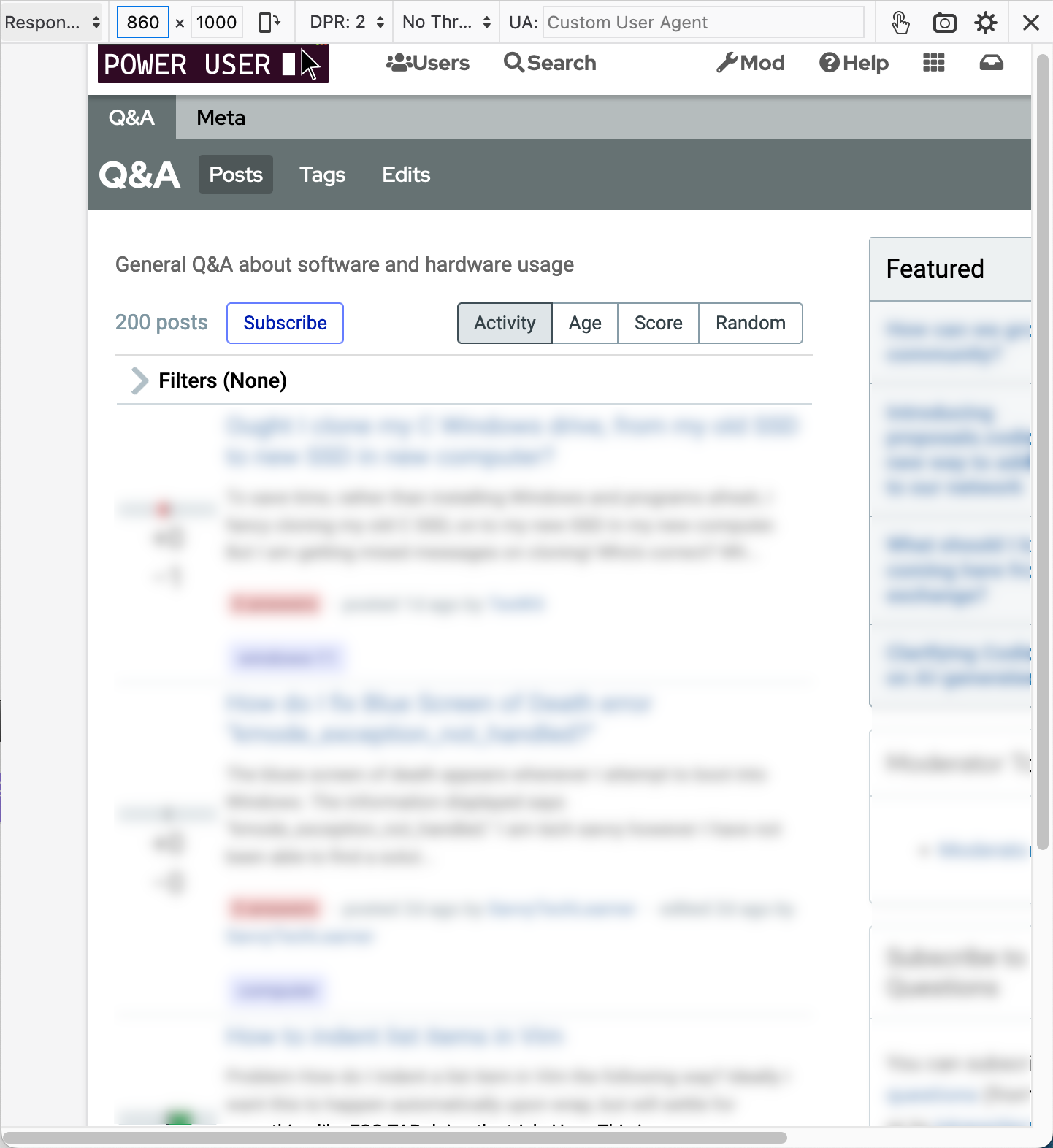
If I use Firefox's responsive design mode and manually increase the page width to 860 px, I get a much nicer layout with a wider main column and the only infrequently used right sidebar is partially hidden behind a scroll bar:
Is there a way to use a userscript or userstyle to permanently change the width of a site?
Environment:
- Firefox 115.1.0esr
- macOS 13.5
1 answer
The following users marked this post as Works for me:
| User | Comment | Date |
|---|---|---|
| samcarter | (no comment) | Dec 5, 2023 at 22:05 |
The following is a UserScript which will edit each page's CSS to always use the widest media rules:
// ==UserScript==
// @name         Disable Responsiveness
// @description  Always use the widest version of a responsive website
// @author       Ullallulloo
// @version      1.0
// @match        https://*/*
// @match        http://*/*
// @grant        GM.xmlHttpRequest
// @connect      *
// ==/UserScript==

for (let i = 0; i < document.styleSheets.length; i++) {
	const styleSheet = document.styleSheets[i];
	console.log(styleSheet);
	try {
		if (styleSheet.cssRules) {
			updateRules(styleSheet);
		}
	}
	catch(e) {
		if (e instanceof DOMException) {
			GM.xmlHttpRequest({
				method: "GET",
				url: styleSheet.href,
				onload: function(response) {
					const styleSheet = document.createElement("style");
					styleSheet.innerHTML = response.responseText;
					document.head.appendChild(styleSheet);
					updateRules(styleSheet.sheet);
				}
			});
		}
		else {
			console.log(e);
		}
	}
}

function updateRules(styleSheet) {
	for (let j = 0; j < styleSheet.cssRules.length; j++) {
		if (styleSheet.cssRules[j].media?.mediaText.includes("max-width")) {
			// console.log(`Deleteing rule ${styleSheet.cssRules[j].cssText}`);
			styleSheet.cssRules[j].media.mediaText = "(max-width: 0px;)";
		}
		if (styleSheet.cssRules[j].media?.mediaText.includes("min-width")) {
			// console.log(`Always using rule ${styleSheet.cssRules[j].cssText}`);
			styleSheet.cssRules[j].media.mediaText = "(min-width: 0px;)";
		}
	}
}
Note that sites, including Codidact often include CSS from third-party sites/CDNs, so any editing of them will require permission to handle cross-origin responses, which is a potentially dangerous permission to give out to untrusted code. You will have to explicitly agree to allow this permission for domains. Also, somewhat obviously, if you use a layout designed for a larger screen, some things may become undesirable sizes. It could potentially be tweaked to set a maximum width for styles to optimize the appearance for a device.

1 comment thread